The User's Mind is Full
Technology in our lives is hitting its limit.
At first software developers vied for the user's dollar, then they wanted their eyes, then their time, and now we’ve reached the point where apps and software experiences are competing for a user’s mind.
Well, the user’s mind is full and their experience sucks.
We now carry computers in our pockets, and the role of technology has changed as a result. Computing now interacts with us moment to moment, and technology dictates how we go about our day. We do not use technology in sessions anymore, we use it constantly, and as such the way we design must change.
While devices are becoming drastically more feature rich that is not translating to a better quality of experience for the user. Developers optimize for user engagement (time spent in the app or software) by creating new features, functionality, and catchier designs, and the user experience is suffering.
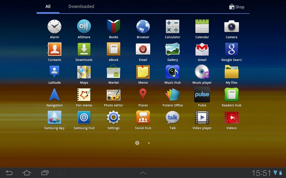
Now it’s difficult to even know which apps to use. Apps each do incredibly unique things and understanding each and every one is an ordeal that few people want to do. If developers cannot get their message to the user, the users are worse off for it.
Apple and Google have begun to tackle this problem by taking the best apps and features that small developers have pioneered and made their own versions to include with the OS.
Even if people can find the app or software they want the odds they’ll remember it or use it again are slim. Software experiences are divided and partitioned into separate apps and web pages.
People waste time and mental capacity understanding software
This leads to behavior like people using Gmail for notes. They know it works and they don’t have to think about it. This is a better experience for them.
Even finding the tools we want on our devices has become costly.
If an app or service is not used frequently enough to be at the forefront of a user’s mind they will forget it and it will die.
How do developers address this?
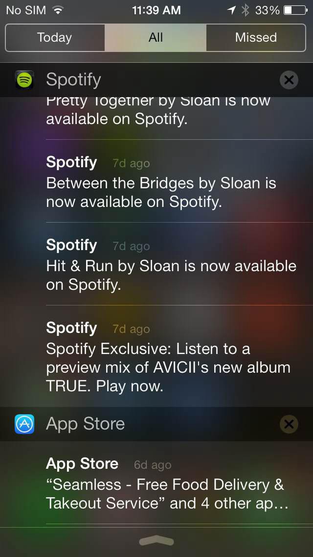
They try to engage the user more and pull them back into their experience. They send notifications, push tiny updates, employ addictive designs, and optimize for user retention. What is the result? The user is even more overwhelmed, and they have less time for each app and experience.
Something is wrong.
We need to rethink the role of software, for the user’s sake
Software needs to be simultaneously explicit with its design, and broad with its possibilities.
Technology needs to optimize for contentedness. Rather than focus on engagement developers should focus on ensuring the user is satisfied and that they’ve accomplished their task in a time efficient manner.
Developers need to target possibility spaces, not individual problems. Create an app to do something that is flexible, that is a tool, not something that is targeted towards a specific individual task. Create something that can be used in many ways and doesn’t impose restrictions on the user, but trim the fat so that the user only has what they need.
Presently many app developers strive to solve each individual problem with very targeted solutions, but this only contributes to the noise in a user’s life. Ultimately these solutions go unused.
Instead developers should create experiences that are broad and well thought out within a problem space rather than amazing at one thing in that space.
We see dozens of note taking apps tailored to every form of note. Short notes, long notes, reminders, journals, class notes, meeting notes. A user could have many apps and their experience would be fragmented and confusing, ultimately making their experience worse. An app that targeted this space broadly could simplify the user’s life drastically by simplifying their mental model of how they use their software. There is a reason that so many use a simple notebook daily; it imposes no restrictions and has enormous potential.

Many turn away from technology because they feel it is restrictive and confining, but it does not have to feel this way. We must learn to design experiences that enable clarity and productivity. By expanding the possibility space of what we design, and reducing the complexity, we can make experiences that are more natural feeling and reduce mental clutter, ultimately making the lives of people better.